Certain baby-related items seem designed expressly to irritate older moms such as myself. Consider, if you will, this Dr. Brown’s bottle:
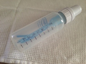
Perhaps you’ve noticed that the numbers are drawn on with a Sharpie. Well done. And perhaps you know that Dr. Brown’s bottles are very popular for their claim of reducing colic. I like them because they prevent my baby from chugging his meals and then returning a large portion thereof to my clothing, his clothing, and sometimes, the floor.
But the only volume markings are tiny, and stamped into the plastic. Embossed, if you will, like a fancy piece of stationery. Great for fancy people, useless for old coots such as myself. I mean, really:
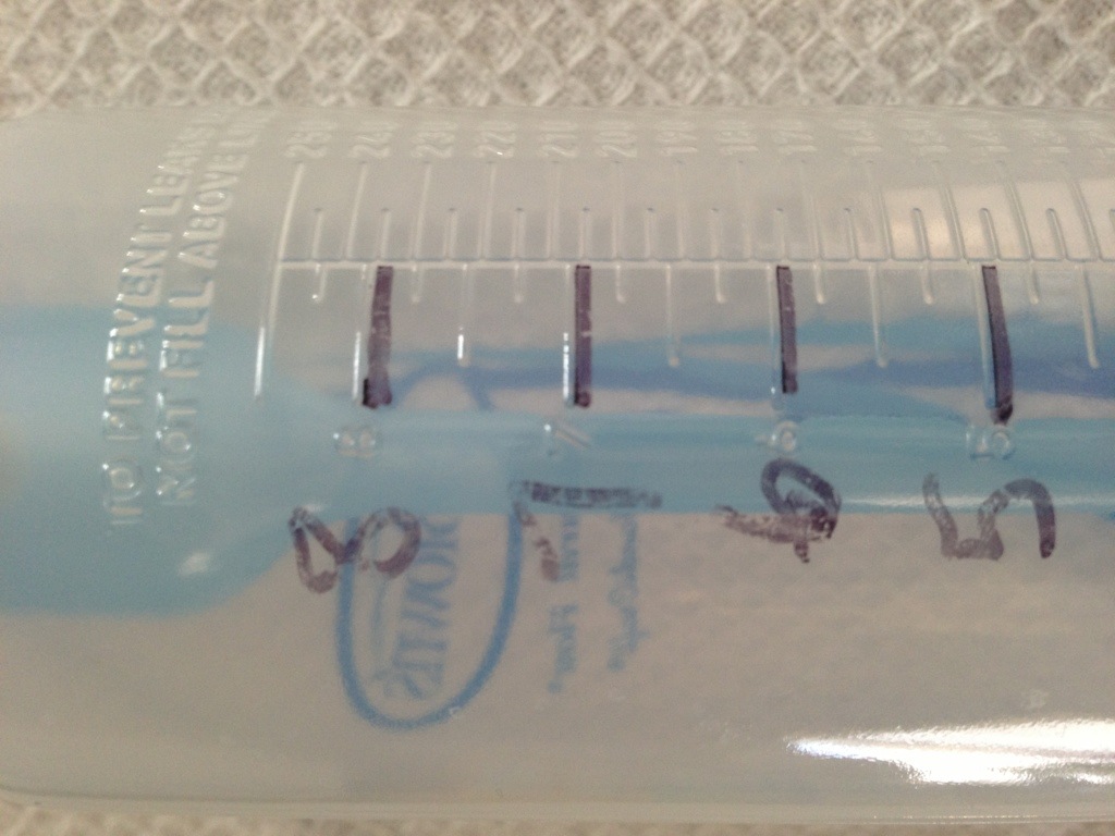
Non-parents may be confused by this point, so let me enlighten you: In the early days of babydom you care very much about how much your baby is eating. You’re also getting up to feed your squirmy bundle a few times a night and trying to keep the lights low so said bundle will drift back to sleep quickly and peacefully. Even if your eyes aren’t a bit older, you can’t see those numbers unless you turn on a bright light, and trust me, you don’t want to do that at 3 a.m.
So, Dr. Brown, congrats: You win this week’s Appalling Design Award. You clearly care about good design, but why couldn’t you take that extra step and print the damn numbers on the bottle with, oh, I don’t know, ink?
